I am teaching a partial credit course for the Languages and Cultures and Humanities Residential Colleges this year, called Humanities in Action. This is a project based course that meets once a week over supper to develop ideas for Humanities based projects and develop and design them in a group.
As I have been working with students and faculty on various projects in DH I have wanted to have one page where I put together sites/tools/tutorials that are helpful to us. I am compiling these here and this is still a work in progress, but it might be useful to colleagues out there also. In DH we tend to learn collaboratively; so many of the tutorials are adapted from colleagues who have pioneered this approach to teaching, such as Miriam Posner at UCLA and Alan Liu at UCSB,
Tools for DH–Humanities in Action
There are some basic tools that can help you with your DH projects, whether you know programming or not. Here are some of the ones my students and I have found most useful. Tutorials are also linked.
Text analysis

Voyant is the best multi-tool text analysis platform for a start. The version that is online is the earlier release and can be found as part of the suite of tools that can be found here. There is a new version of Voyant that brings these different platforms into one interface and which doesn’t require switching between tools. If you want to use that, ask me. I have a version on my thumb drive.
Voyant is very good as a concordance and frequency analysis visualization tool. It can work with large amounts of text in multiple files. You can compare aspects of different texts easily. For example, which words come up most frequently in which texts; which terms are collocated; what are the vocabulary densities of different texts?
Here is a tutorial for Voyant 2.0
There are also sites/tools for analyzing large amounts of text data from a macro or high level perspective: for example, Google Ngram viewer which visualizes word frequencies in the corpus of Google digitized books (in multiple languages) and Bookworm which visualizes trends in repositories of digitized texts.
Topic Modeling
 Topic modelling is a method by which your text is chunked into pieces and a computer works out what the most important topics are in the chunks. The algorithm is not interested in meaning, just in related concepts. The best tool for this is MALLET; a Java-based package for statistical natural language processing, document classification, clustering, topic modeling, information extraction, and other machine learning applications to text. MALLET includes sophisticated tools for document classification: efficient routines for converting text to “features”, a wide variety of algorithms (including Naïve Bayes, Maximum Entropy, and Decision Trees), and code for evaluating classifier performance using several commonly used metrics.
But if you are not comfortable with command line programming there is also an online version that can work for smaller amounts of text. That can be found here.
There is also a nice demo tool that can be used to identify topics, themes, sentiment, concepts at AlchemyAPI
 Miriam Posner has written a great blog about how to interpret the results from Topic Modelling outputs.
Mapping
There are lots of online platforms out there for mapping data. It all depends how fancy you want to get and whether you want to do more than map points.
CartoDB is definitely fast and flexible. If you have a csv with geo-coordinates you can upload in seconds and have a map. It also has a geo-coder that can quickly turn your list of places into latlongs.
Another way to go is through Google Fusion tables. Again this is a super fast and easy way to map data. You can also produce a nice “card view” of entries that will make your Excel spreadsheets into much more reader friendly format. There are also other multiple ways to visualize your data in graphs, networks, and pie charts.
ArcMap online is another way to go if you want to produce far more sophisticated mapping visualizations, such as Story Maps and Presentations. Bucknell has an institutional account. If you want to use it, let me know.
Palladio is an interesting multi-dimensional tool from Stanford Literary Labs. It can produce maps, networks, timelines and graphs of your data. Here is a tutorial for my HUMN 270 class, written by Miriam Posner.
Building 3D Models
This is a part of DH I have not yet ventured into, but others on campus definitely have! The easiest entry into modelling is SketchUp. We also have Rhino loaded on the machines in Coleman 220 and it is regularly used in Joe Meiser’s Digital Sculpture class.
Timelines
 There are various platforms out there for constructing digital timelines that also allow for the inclusion of multimedia elements and one, Timemapper, also allows for a mapping window. Most frequently used are Timeglider and Timeline.js
Creating a Digital Exhibition
If you re interested in curating a digital exhibition of artifacts, the best platform to use is Omeka.net. This is a free online version of the more robust and versatile Omeka.org platform which has to be installed on Bucknell’s servers (which can take a while). Omeka.net allows you to upload digitized images, documents, maps etc to a “collection” that can then be arranged and curated as an online exhibit. This is particularly useful if you have found a collection of photographs (maybe your own) that you would like to present in a public facing platform with a narrative logic.

Again, if you want to do this I am happy to show you how. Here is a link to my own (developing) Omeka site at Bucknell on the Stories of the Susquehanna. The server-based version has a very nice visualization tool called Neatline, which allows you to link the digital artifacts in your collection to a base image (maybe a map or a painting) and then annotate. This is an example I am developing for the 1750s Itinerant Preachers’ Map of Pennsylvania which I have used a great deal in my research and also in my teaching. There is also a Timeline widget you can activate. I have discovered a great tutorial on how to use Omeka and Neatline here, put together from a workshop given at the Michelle Smith Collaboratory at the University of Maryland.
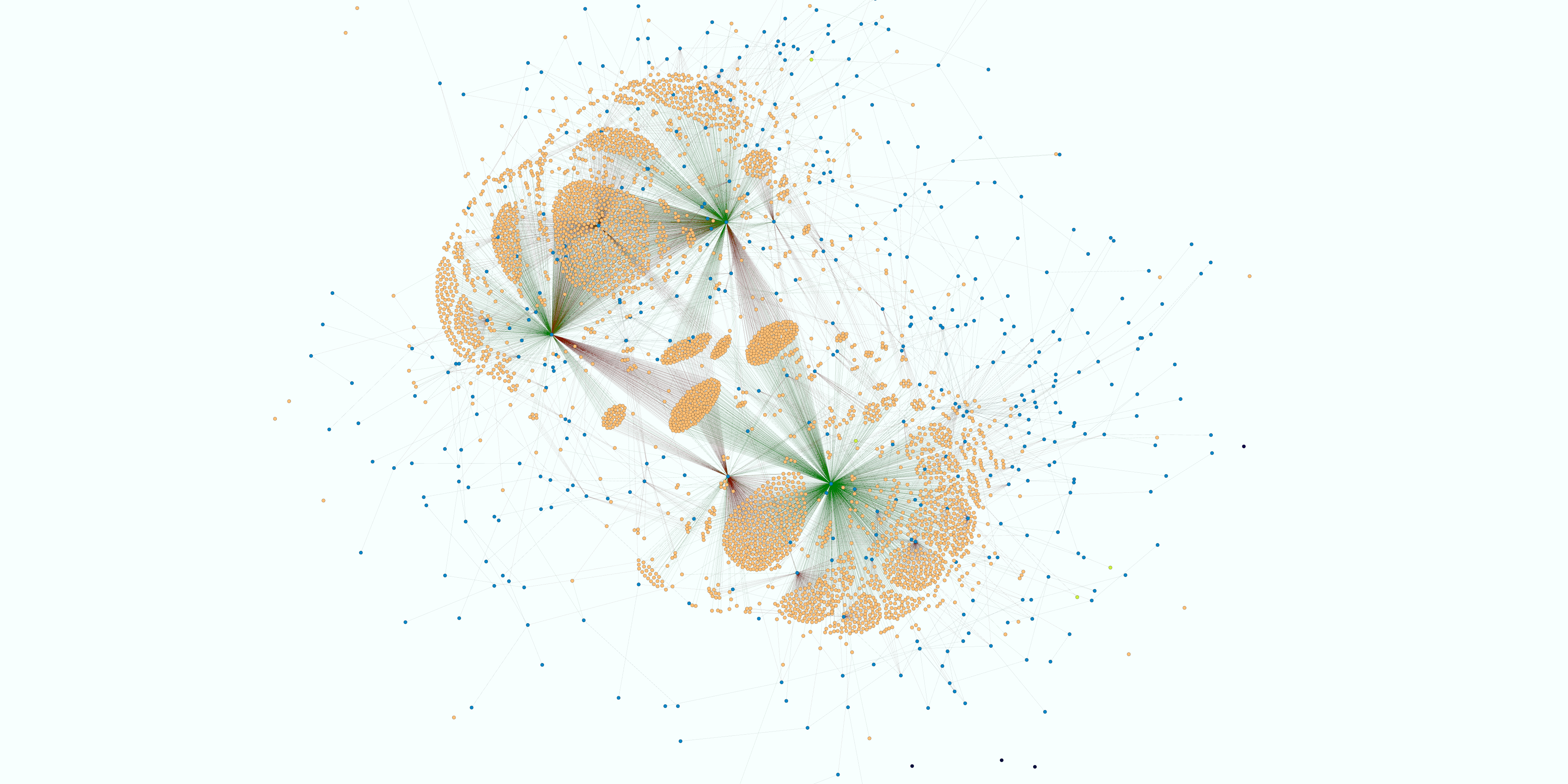
Networks
If you want to create a network visualization in more detail and depth, use Gephi. Gephi is an open source, free, interactive visualization and exploration platform for all kinds of networks and complex systems, dynamic and hierarchical graphs. It runs on Windows, Linux and Mac OS X. One of most important issues to consider before investing a lot of time in learning Gephi is whether or not your research question might be answered through using this visualization platform. Ask yourself these questions, and then if the answer is yes, prepare your data! Gephi has an excellent set of tutorials on GitHub. Data can be prepared directly in Gephi or can be imported in csv format.